

Fair warning: this post is going to get fairly nerdy, discussing details of my first printing steps in my new Darkroom and making comparisons with digital prints. Hopefully it’s interesting for those of you who’ve been following my progress, but for those that don’t care too much about printing I’ll talk about this post’s accompanying photo first so that you can bail out early.
About The Photo
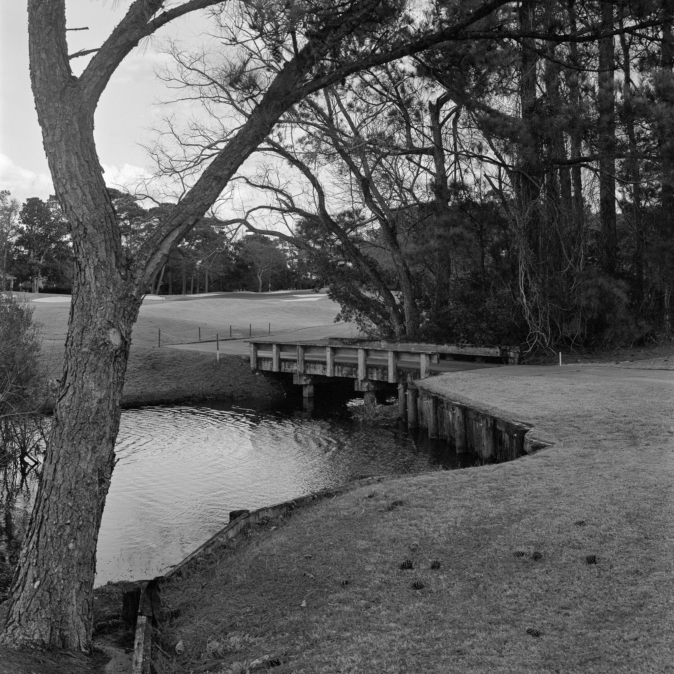
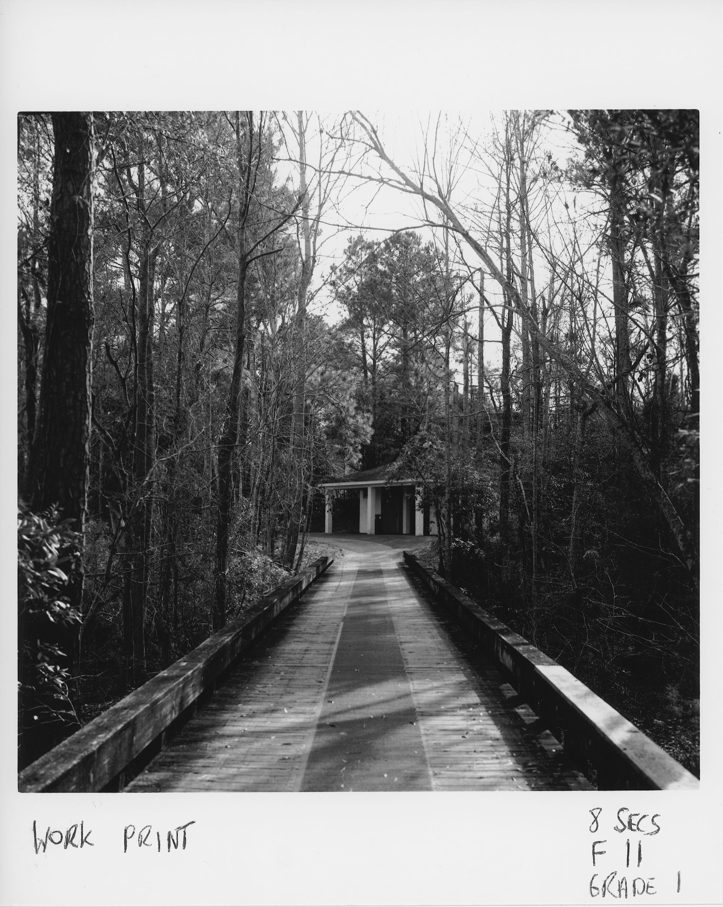
This is another view taken on my daily walk. The route winds through a golf course and there are lots of these little wooden bridges across the various water features that provide rather nice set ups for strong compositional shots. I’m starting to recognize a marked graphical diagonal theme in many of my photos for this POTD project, together with a lot of use of leading lines, and that’s the case here. I like the zigzagging lines that take your eye from the bottom left to the top(ish) right of this photo. I tried very hard to keep all the elements in the frame in focus with deep depth of field, so that the composition leads your eye around the shot rather than putting select elements in/out of focus. Overall the photo’s a bit too busy. For example, the bush on the bottom left is crowding the tree. If I was only printing this digitally I would probably remove it.
Technical details
Camera: Rolleiflex 2.8 F
Film: Ilford XP2 Super
Shutter Speed: 1/60
Aperture: f16
I love, love, love Ilford XP2 Super. I can process it in C41 which is simpler than B&W (one timing for all films regardless) and you get 400 speed with the grain of a slower speed film. It’s also very forgiving with under and over exposure. The only drawback is it will probably need to be printed on a fairly hard grade being a “color” film (it scans very grey and low contrast too) which may limit room for maneuver if I have to split grade print.
Darkroom update
The Darkroom is operational! But not without some drama first. Per the sub headline of this post I almost had a disaster to go along with my delight at finally producing an optical print for the POTD project.
Ironically, the almost-disaster happened while I was processing a Tri-X film that I shot for the project. Since I got back into film photography some six years ago I have processed all my own film; black-and-white, C41 and E6. I have never lost a film to a developing error, but there’s a first time for everything and this almost came on Saturday morning just before I started printing. And, of course, if I lose so much as a single film then this POTD project goes up in smoke; there are no analog backups for the lost shots.
I have moved to JOBO rotary processing for this project to try and make my black and white development process more consistent, but I have to say I hate the JOBO 1500 series developing reels and boy was I cursing them on Saturday morning! For some reason I just could not get the film onto a reel and spent about half an hour in the dark fumbling around trying to ratchet it onto a first and then a second backup reel. For some reason it was getting stuck and would not advance, and I was running out of ideas since I had already unrolled the film from its backing paper and couldn’t turn the lights back on. I ended up putting it in the JOBO tank, not on a reel, turning the lights back on and unpacking a third JOBO reel to see if that make made a difference. It did not. Panic! Finally, I figured out (back in the dark) that the sticky piece of tape that holds the film to its plastic core had not been properly removed, and was sticking to the JOBO reel as I tried to load the film. A snip with the scissors finally solved the problem. However, more heart strain as I realized too late that I had put the film back into the JOBO tank earlier without also loading the central core which makes the whole tank light-tight, meaning that I was almost sure to have exposed the film to light. So it was with some trepidation that I processed the film and with huge relief discovered that in fact it had only been subject to a few light leaks at the start of the roll and was not totally lost!
A really inauspicious way to start my day of Darkroom printing, but as they say, onwards and upwards.
Here’s my finished darkroom setup:
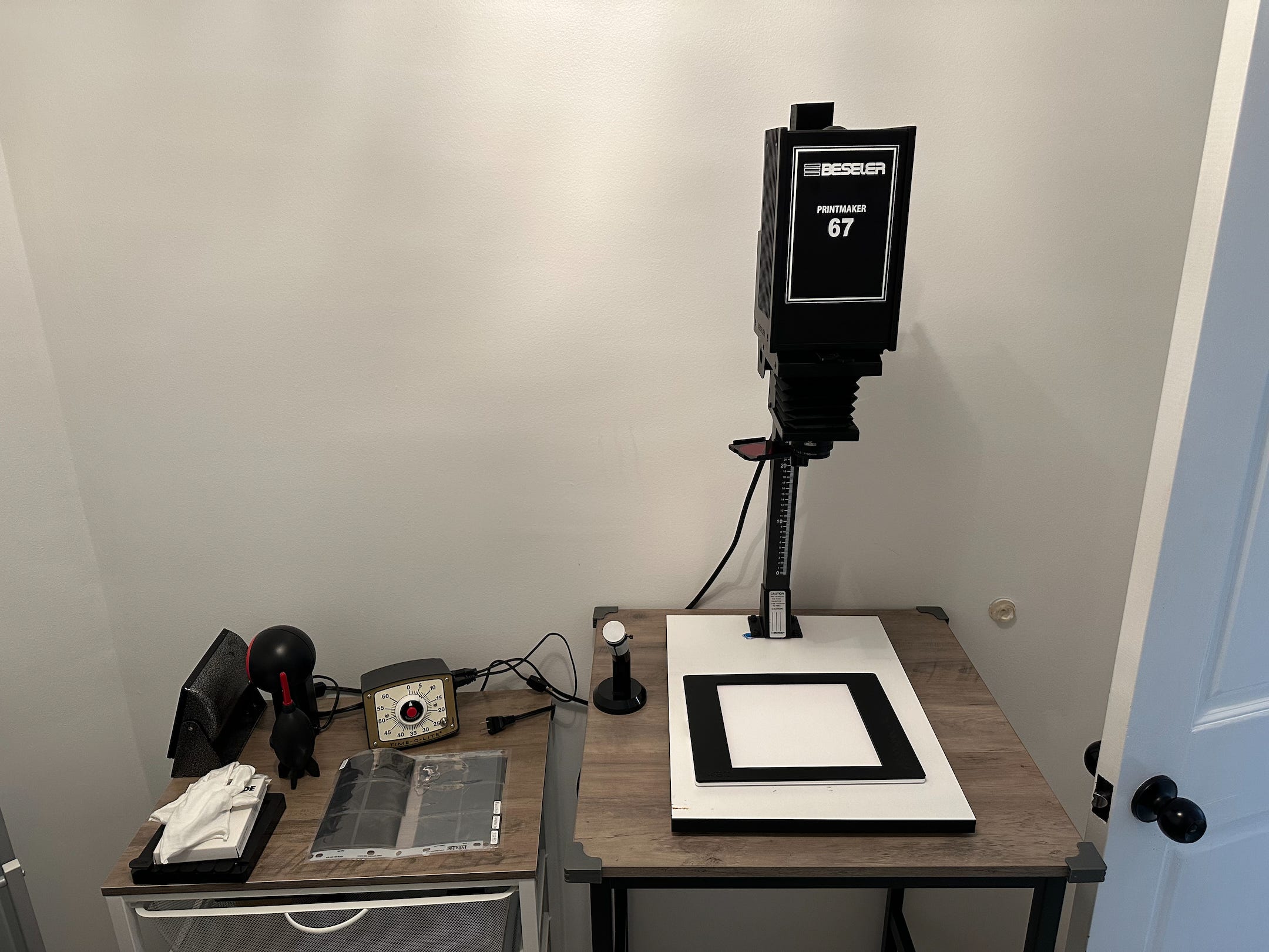
Enlarger station
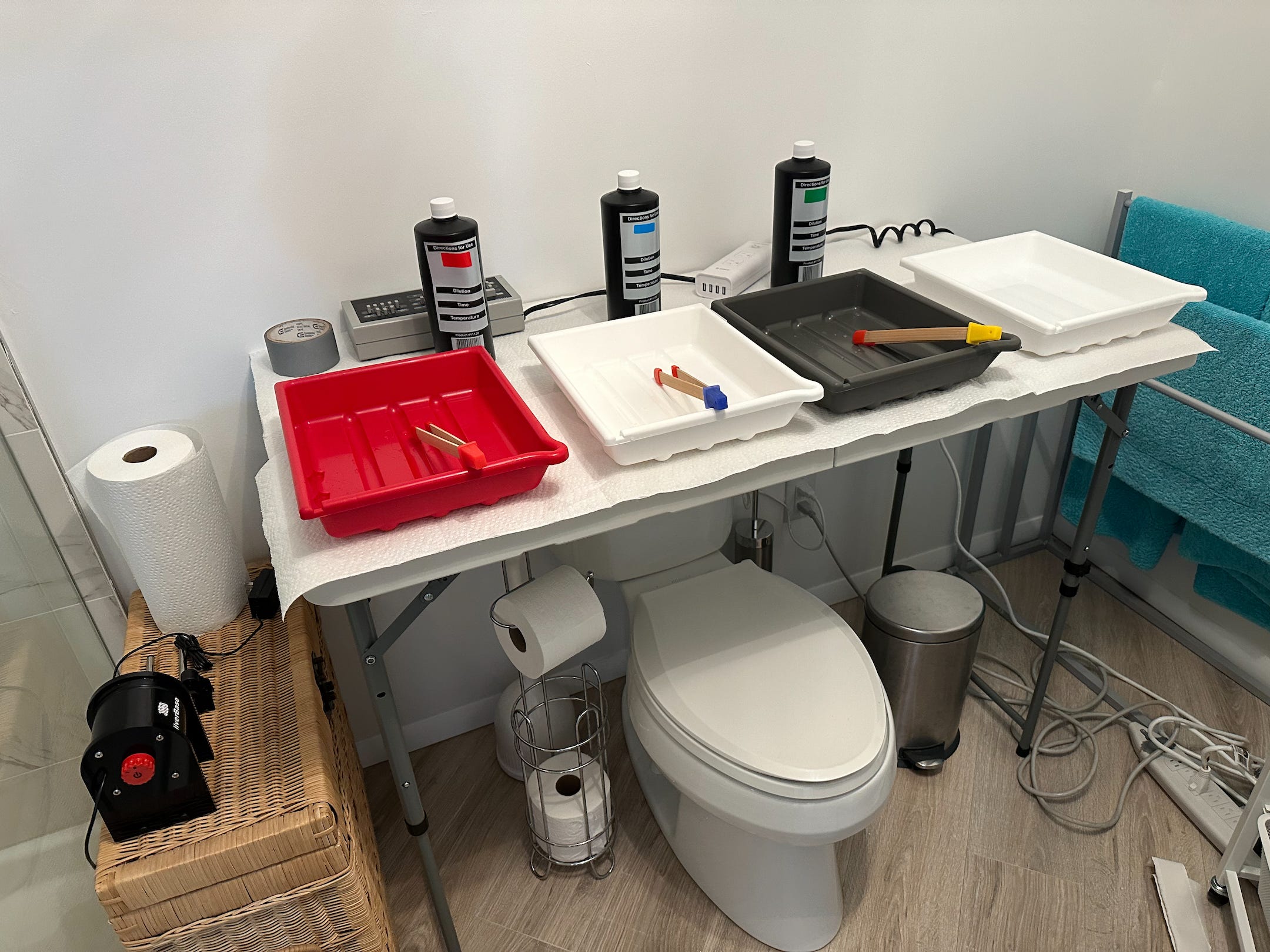
Developing station with complimentary toilet :)
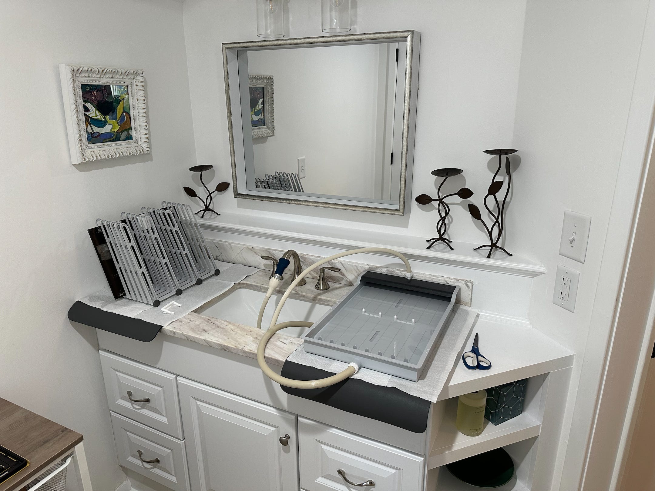
Print wash and drying station
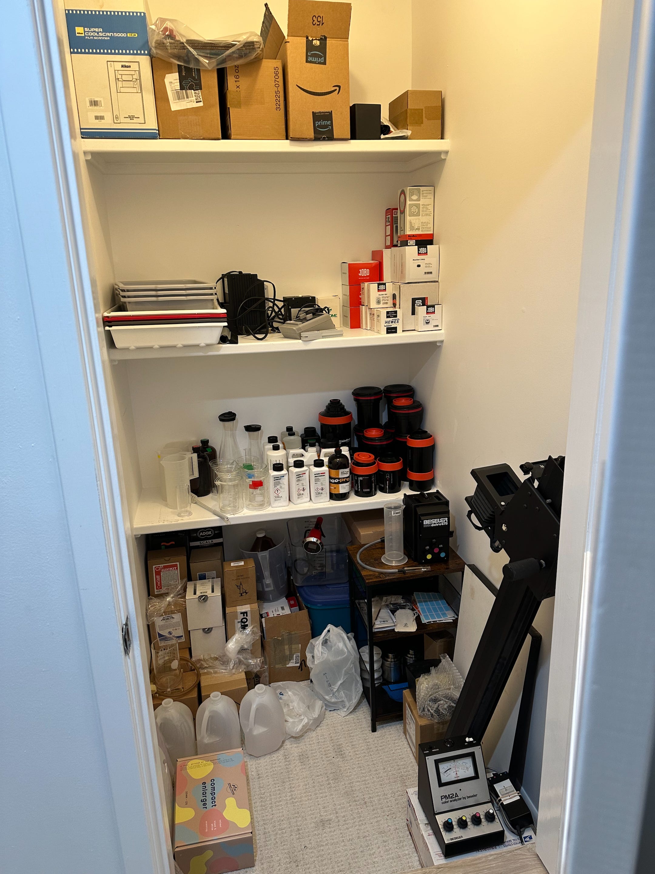
Storage cupboard
Not shown: home-made blackout blinds on outer door making the room light-tight.
And here was the end result:
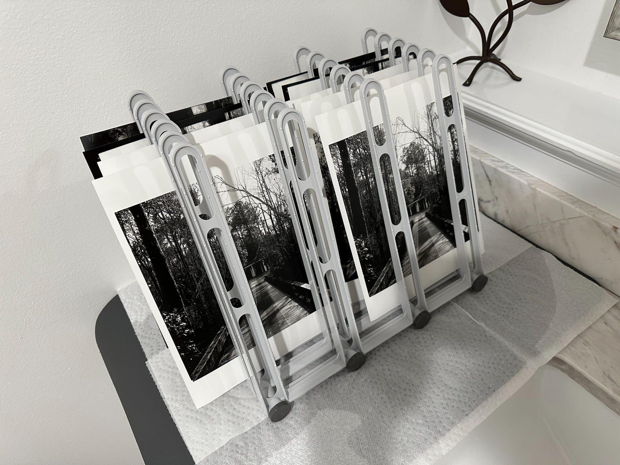
It took me nine prints to get to a workprint that I was happy with, including 4 attempts at a contact print of the whole roll. I also printed the photo on my Epson P900 with a number of different settings (see below), so that I could see the difference between the digital and optical prints.
I have to say that I was very happy with the print, straight off the bat! It has a neutrality and the deep inky blacks that I’ve been expecting from a silver gelatin print. However, it’s clear that I’ll need to do a fair bit of dodging and burning to get it to have the same level of detail as the digital print.
The following is a selection of print comparisons to show the difference between the optical print and various flavors of digital print:
Print Comparisons
Firstly forgive the low quality of these photos - they are quick iPhone snaps taken to illustrate paper color, detail differences etc.
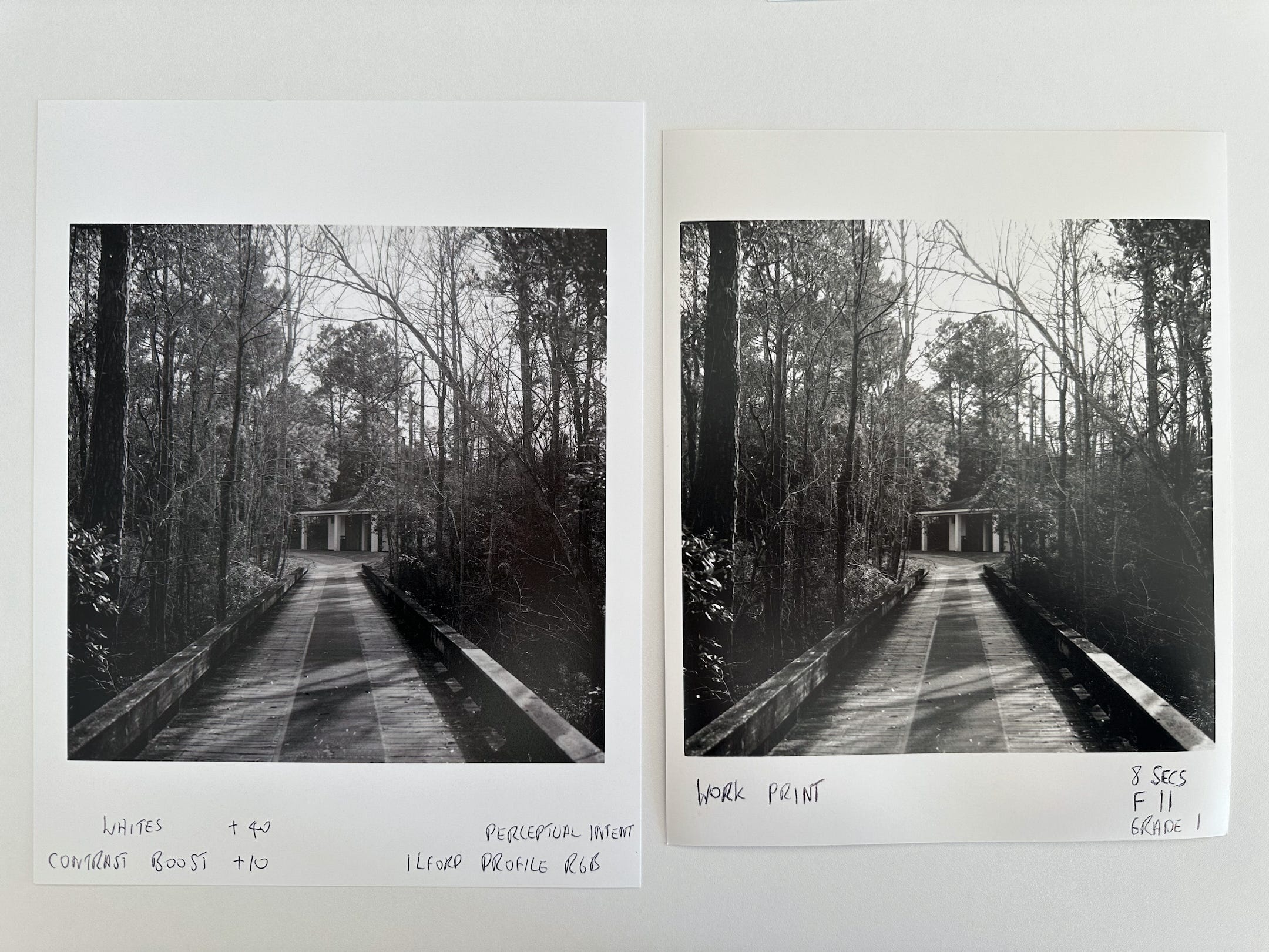
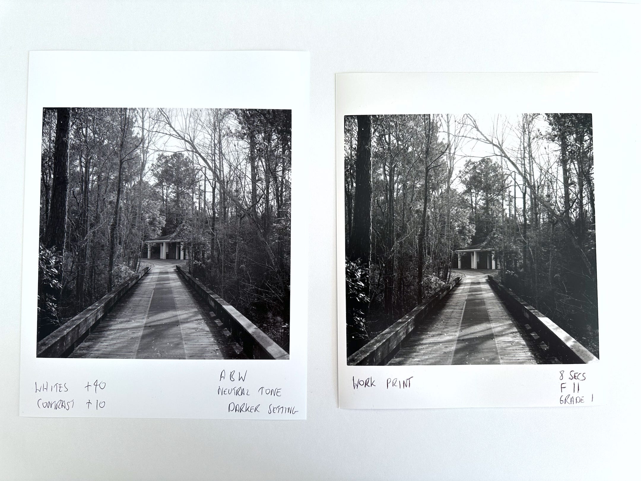
Comparison 1: Workprint on Ilford Multigrade Pearl IV vs Digital Print on Ilford Galerie Smooth Pearl 310 GSM using an RGB P900 profile
Ilford Galerie Smooth Pearl is a fairly close approximation to the Multigrade Pearl paper that I’m using in the darkroom (surface-wise at least although it’s double the weight of the Multigrade paper). Interesting things to note:
The silver print has deeper blacks, no question, even when printed at a low Grade 1.
The silver print is more neutral in real life, even though it looks warmer in the photo above. I was actually fairly pleased with the neutrality of the digital print since it’s printed in RGB using Ilford’s P900 profile. This actually printed more neutral than using the Epson printer driver’s Advanced Black and White mode, but it’s still slightly cool-toned in real life in daylight temperature light, not helped I think by the large amount of optical brightening agents (OBAs) in the paper.
The silver print paper base is slightly off-white compared to the glaring OBA-boosted whiteness of the digital paper (which you can see in the photo above).
The digital print shows much more fine detail in areas of high contrast, due to my limited optical printing technique; the silver print is a straight exposure and needs burning-in the top middle to show branch detail, burning-in the bottom right to show detail on the bridge rail, and dodging in the lower mid-third right to reveal branch detail in the deep shadow. Digital printing is definitely easier and less time consuming!
Comparison 2: Workprint on Ilford Multigrade Pearl IV vs Digital Print on Ilford Galerie Smooth Pearl 310 GSM using Epson Advanced Black and White Neutral Profile
I’m really not sure if it comes through in the photo above, and who knows what you readers are seeing on an un color-managed web or mobile page, but the digital print is slightly cool-toned rather than the silver print being too warm.
I think the digital print using an RGB Ilford profile (in Comparison 1) has better neutrality than the ABW print above which speaks well of my color management set-up I guess.
Again, difficult to see here but the digital print just doesn’t have the richness in the blacks of the silver print.
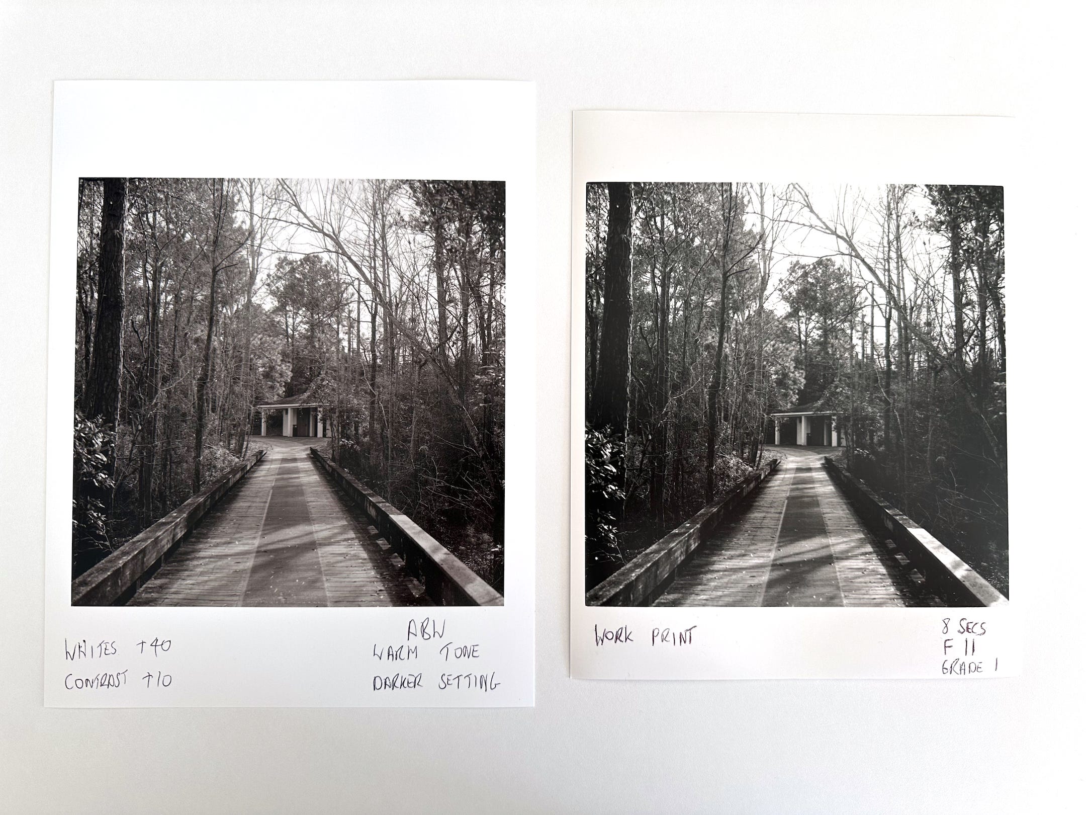
Comparison 3: Workprint on Ilford Multigrade Pearl IV vs Digital Print on Ilford Galerie Smooth Pearl 310 GSM using Epson Advanced Black and White Warm Profile
With the ABW Neutral print being too cool I thought I’d try the “Warm” profile. As you can (hopefully) see above it’s just got too much red in it to be a good match with the silver print.
Conclusions
Optically printing every Photo of the Day to match the detail I can get in my scans will be a huge amount of work and a steep learning curve.
It’s totally worth it! I absolutely love the color, precision and control that I get with color digital printing but I have always felt that digital black and white prints lack the beauty and depth of a silver gelatin print. Even my first fumbling steps in darkroom black and white printing have confirmed this definitively (to me at least). I’d be interested to hear what you all think and whether I’m suffering from a strong case of confirmation bias.
So there it is: an almost-disaster turns to printing delight. Thanks for sticking with me to the end of this rather wonky post!
Good idea to add a toilet to your new darkroom. That way, you can do your business while doing your business and not get everything overexposed. I just skimmed this as it's a bit technical for someone who has just waken up (New Zealand gets up earlier than other countries). But I'll come back to it.
I'm a big believer in the usefulness of constraints, and the need to create them for yourself if you lack a client or customer to provide them. Years ago, I took a trip to attend a conference in London and I made a lot minute decision (as my departing plane was about to board) to take 140 photos (that was the number of characters allowed on Twitter at the time) and post them to Twitter, Instagram, and a Tumblr blog along with a Haiku inspired by the location. It was good fun. Constraints can be very enabling. Only our chains can set us free.
Your set up looks excellent! And it makes me happy to read you are satisfied with the progress and the results! It is inspiring!